Five charts to start your day
Is innovation a fantastic bargain right now or is quality growth back?
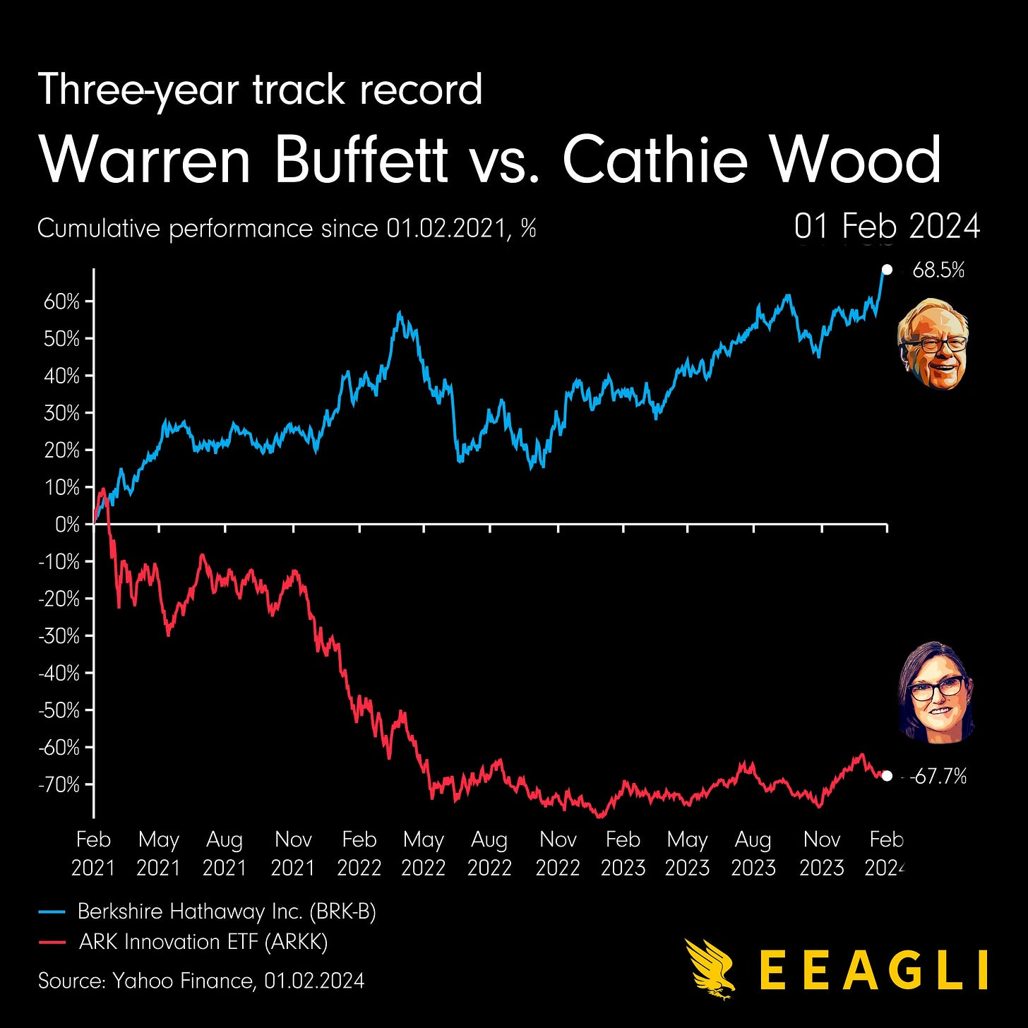
I posted this yesterday, and I think some people might have misunderstood my point. I wasn't really trying to compare apples and pears. This was more about the very different investment environment these two portfolio managers have found themselves in over the last three years.
Prior to the current period on display here, interest rates had been trending downwards for almost 40 years.
Moreover, interest rates fell to absurdly low levels, unprecedented in financial history, following the great financial crisis 15 years ago. Literally everything floated upwards: stocks, bonds, and real estate. We may not have seen rising headline inflation during this period, but asset price inflation went through the roof.
In this environment, it was very difficult for fundamentals to make sense. The distant future was now, and it was being priced in as we saw growth stocks soar to new heights. Despite the strong fundamentals backing them, quality growth stocks languished and fell behind compared to their more glamorous growth counterparts.
Yet times have now changed and after decades of absence, inflation is back, and interest rates have risen at their fastest pace in living memory. So, it's no wonder there has been a sharp divergence between Warren Buffett and Cathie Wood.
Warren Buffett seems to have weathered one of the toughest periods his investment philosophy and style have ever faced in his career, emerging stronger than ever, albeit with a huge mountain of cash yet to be deployed.
By contrast, Cathie Wood has not fared as well at all, as her growth style no longer fits the current investment climate. Even though she may believe that innovation is now available at a discount, markets are less willing to price the distant future in right now, unless it's related to AI and revenue-exploding mega techs.
Coming up:
Alphabet’s (Google) income statement visualised
Apple has bought back $619 billion in stock over the past 10 years
YouTube has captured the attention of every generation
Comparing the population of each US state to other countries
If you like what you see here, and you would like to view the other four charts, consider becoming a paid subscriber. It costs less than two cups of coffee for a whole month’s access.
Keep reading with a 7-day free trial
Subscribe to EEAGLI to keep reading this post and get 7 days of free access to the full post archives.


